
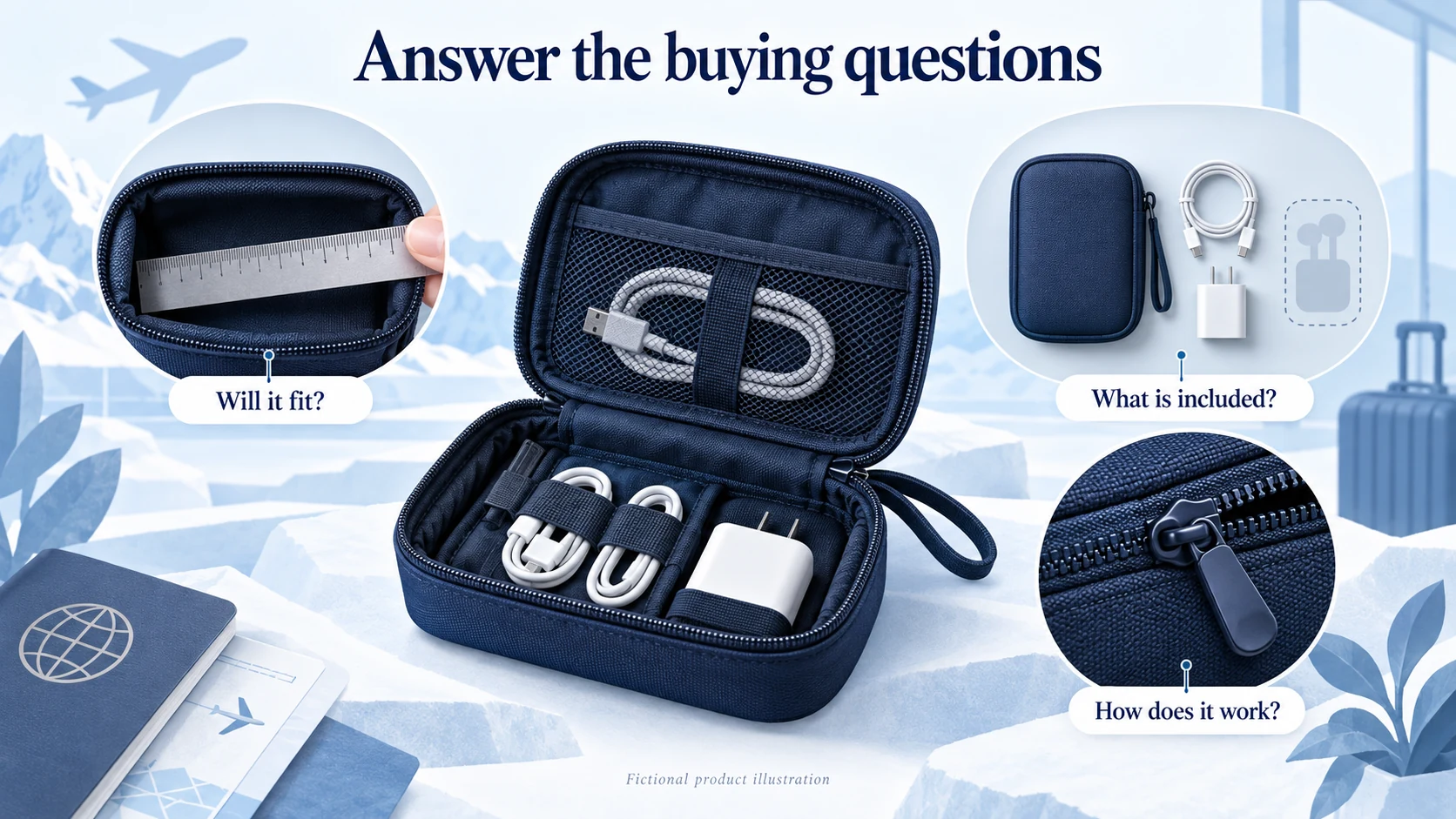
A dropshipping landing page should continue the promise that brought the visitor, show the exact product and offer, answer delivery and return questions, and lead to a working checkout. Its job is to help a suitable customer decide to buy with realistic expectations. Measure paid orders and contribution after costs, not just button clicks.
A persuasive video can bring someone to the page, but it cannot explain a missing size, an unexpected shipping charge or a delivery promise the supplier cannot meet. Those details belong in the buying experience before payment.
01
Choose the page around the decision
You do not always need a separate campaign page. A well-developed product page can be the landing page for an ad, especially when the visitor already knows the item and wants its price, variants and specifications.
A dedicated page becomes useful when a particular audience needs a different explanation or offer. An organizer sold to frequent travelers might need a demonstration inside a carry-on bag; the same item sold for home-office use might need cable and charger dimensions. Both pages must describe the same actual product accurately.
| Visitor’s situation | Suitable destination | Main decision to support |
|---|---|---|
| Searching for a specific item | Detailed product page | Is this the right version at an acceptable delivered price? |
| Responding to a demonstration ad | Product or focused campaign page | Does the product solve the problem shown in the ad? |
| Choosing between several sizes or kits | Guided comparison or collection page | Which option fits my situation? |
| Interested in a product not yet available | Clearly labeled notification or waitlist page | Do I want an update when there is a real offer? |
An email signup is evidence of interest, not a paid order. If you are testing a concept, explain its status and what signing up means. Do not make an unavailable product appear ready to ship merely to measure checkout intent.
The page’s message should also fit the wider branded dropshipping offer. A calm, specific store loses credibility if an ad-specific page suddenly invents a factory closure, a countdown or a different return promise.
02
Make the first screen continue the ad
The opening needs to identify the product and the reason to consider it. Show the item in a recognizable form, state the offer and give a clear next step. If the ad promotes a two-piece kit, customers should not land on the price of one piece without an obvious explanation.
Google’s landing-page guidance emphasizes this connection between the ad, the destination and the action customers expect. Matching a keyword is only one part of it. The advertised price, contents and conditions must match too.
For a product requiring size selection, “Choose your size” can be more helpful than a buy button that adds an arbitrary default. For a simple one-variant item, “Add the organizer to cart” gives a clear action. Repeating the same primary action farther down the page is reasonable; adding unrelated newsletter, social-follow and discount-popup demands can interrupt the purchase.
Put the delivery information close enough to the purchase controls that it will be seen. It can be compact and destination-dependent. “Delivery estimate shown after you choose your country” is useful only if that estimate actually appears before payment.
03
Build the page around the questions the product creates
Consider this fictional campaign brief for a travel cable pouch. The item, dimensions and price below are examples, not an AIDrop product or a tested campaign. A real page would need facts and photographs of its actual sample.
The campaign targets travelers who want their everyday charging accessories in one place. The offer is one pouch for $32. It is not a charger bundle, and it is not a waterproof case.
| Page section | Example content | Why it belongs there |
|---|---|---|
| Opening offer | “Keep your charging essentials together.” One cable pouch, $32; electronics not included | Establishes the item and prevents confusion about the pictured accessories |
| Product demonstration | A real video loading the specified cable, plug and adapter into the pouch | Shows access and capacity without an exaggerated animation |
| Fit and dimensions | External size 22 × 14 × 5 cm; show the usable compartment measurements separately | Lets buyers compare with their own accessories |
| Contents and variants | One pouch; list available colors, interior layout and included parts | Makes the order specific enough to fulfill |
| Important limitation | “Check larger power adapters against the compartment dimensions. Not intended to protect electronics from immersion.” | Prevents a likely fit or protection misunderstanding |
| Delivery and returns | Country-specific order-to-delivery estimate, shipping charge and short return summary | Resolves the cost and timing questions before checkout |
| Evidence | Actual sample photographs and any genuine, relevant customer feedback | Supports the description without invented popularity |
| Purchase section | Selected color, current quantity, price and working cart action | Turns the decision into the correct order |
This is a content sequence, not a requirement to build eight identical boxes. The demonstration and fit information may share a section. A short comparison image might explain the difference between two pouch sizes better than several paragraphs.
The useful headline depends on what the product really does. “Never lose a cable again” promises behavior the pouch cannot control. “One place for your everyday charging accessories” describes the intended use without guaranteeing an outcome.
The same discipline applies to bundles. Show each included item, whether colors can be mixed, what the bundle saves against a genuine comparison price, and whether everything ships together. A photograph containing optional accessories needs a clear caption.
04
Show evidence at the point where someone needs it
Choose visuals by the question they answer. A dimensions image belongs beside fit information; a closure demonstration belongs beside an explanation of access; a close-up of stitching belongs beside construction details. Four near-identical lifestyle photographs do not answer four different questions.
Use photographs or video of the actual version being sold. Confirm permission before using supplier or creator material, and check that it does not show an older design, a different size or accessories missing from your offer. Generated conceptual imagery can explain an idea, but it should not pretend to document product performance or a customer’s experience.
Reviews need the same relevance. A review of the base item may not describe your delivery, packaging or customer support. A testimonial from a tester should accurately reflect their experience and disclose a material connection when needed. The FTC’s review guidance explains why fake or false testimonials create more than a copywriting problem.
If the product is new, show its construction and limitations instead of filling an empty review section with invented quotes. Leave out unsupported health, safety, environmental or performance claims. A supplier’s attractive phrase does not establish the evidence needed for your advertising.
05
Explain delivery and returns before the buying decision
The customer experiences the whole wait, from ordering to receiving the parcel. A carrier’s transit estimate does not include every earlier step. Processing, made-to-order production, stock transfers and weekends can affect the promise you make.
Write an estimate for the product, dispatch location and destination you actually support. Explain whether it uses business or calendar days and whether taxes or import charges are included in the displayed offer. If the amount cannot be known until the address is entered, make that clear and show it at the appropriate step before payment.
For covered US merchandise orders, the FTC’s rule requires a reasonable basis for the stated shipment time and procedures for delays. Calling an unsupported promise an “estimate” is not a substitute for an operation capable of meeting it.
A short return summary should tell customers where to start, what main time limit applies and who pays ordinary return postage. Link the full policy, and keep statutory rights and applicable exceptions intact. Do not advertise “free returns” if your process normally requires the buyer to pay international postage.
The supplier’s credit policy and the store’s obligations to customers are separate. Work out the return and refund process before using it as a selling point. A page can create a costly promise in a single sentence.
06
Remove obstacles on the actual phone and checkout
Review the page on a phone using the route an ad visitor will take. Open the link, select a variant, read the delivery information and reach checkout. Confirm that the chosen variant and price survive each step.
Look for practical failures: a sticky purchase bar covering the size selector, a consent banner blocking the button, a keyboard hiding an address field, a discount that disappears in the cart, or a popup reopening after every page transition. These can be fixed directly without waiting for an experiment to prove they are inconvenient.
Compress large images, serve appropriate sizes and avoid loading multiple heavy videos before anyone plays one. Reserve space for media so the purchase button does not move while someone taps it. Keep important text as text, with readable contrast and visible keyboard focus.
Shopify recommends placing test orders before launch to check checkout, processing, inventory, shipping and taxes. Use the appropriate test mode and make sure real payments are enabled again before accepting customers. A beautiful page with an unusable payment flow cannot produce a meaningful product test.
07
Measure paid orders and their contribution
Define the main outcome before changing the page. For a sales campaign, track purchases alongside the earlier steps: landing visits, variant selection or add-to-cart, checkout starts and completed payment. Use a consistent denominator, such as eligible landing-page visitors, and a defined conversion window.
Check the measurement with a test transaction. A purchase event should not count twice because the thank-you page was refreshed or both browser and server tracking reported the same order. Keep test orders out of the commercial result, and reconcile tracked purchases with actual order records. Advertising platforms can attribute the same order differently; adding all their reported purchases together can overstate sales.
Here is a hypothetical comparison, designed to show why a higher conversion rate may still leave less money. Both versions receive 1,000 eligible visitors and incur $250 of advertising cost. Assume each order is one item, the modeled variable cost is $20 per order, and that amount includes product, fulfillment, payment costs and an expected allowance for refunds or exceptions. These are illustrative inputs, not observed performance.
| Result | Version A | Version B: lower price |
|---|---|---|
| Paid orders | 25 | 35 |
| Purchase conversion rate | 2.5% | 3.5% |
| Selling price per order | $32 | $26 |
| Revenue | $800 | $910 |
| Variable costs | $500 | $700 |
| Contribution before advertising | $300 | $210 |
| Contribution after $250 advertising | $50 | −$40 |
Version B converts more visitors and generates more revenue, yet its smaller per-order contribution does not pay for the traffic. This calculation does not prove anything about how a real audience would respond to the price change. It shows which outcome needs to be measured if the experiment produces those orders.
Overhead and income tax are not included, so the last row is not net profit. Replace estimated exception allowances with realized cohort outcomes when enough time has passed; do not subtract both the full allowance and the same actual losses without reconciling them. The unit economics guide develops the cost model behind this decision.
08
Run a test you can interpret
Write a specific hypothesis. For example: “Showing the usable compartment measurements beside the selector will reduce fit uncertainty and improve completed purchases without increasing fit-related returns.” That is more useful than “make the page more premium.”
Assign comparable visitors randomly to the current page and the variation, and keep assignment consistent where the testing system supports it. Run them concurrently so a weekend, promotion or change in advertising mix does not become the apparent effect of the page. Record device, destination and traffic source to investigate major imbalances.
Choose the primary metric, minimum improvement worth detecting and stopping rule in advance. The required sample depends on the baseline rate, effect size and statistical method. Neither 1,000 visitors nor two weeks is a universal threshold. Small differences from small samples can be ordinary variation. Avoid ending the test just because one version briefly moves ahead.
Keep guardrails for refunds, cancellation requests, support contacts and order value. A page that hides a limitation may increase immediate purchases while creating more disappointed customers. Allow enough time to see relevant downstream outcomes before calling the change commercially better.
If the store has too little traffic for a useful experiment, observe a few suitable users attempting the purchase, fix clear errors and review their questions. Treat those findings as qualitative evidence. You can improve an obvious explanation without claiming a measured conversion lift.
09
Frequently asked questions
Does a dropshipping store need a separate landing page for every product?
No. Use a strong product page when it answers the visitor’s questions. Create a separate page when a campaign, audience or offer needs a distinct explanation. Extra pages also create more prices, claims and policies to keep consistent.
Should the page be short or long?
Make it long enough to support the decision. An unfamiliar, expensive or compatibility-sensitive product usually needs more explanation than a simple replacement accessory. Put the main offer first and let customers find detail without forcing them through repetitive sales copy.
What is a good conversion rate?
It depends on traffic quality, device, price, destination and what counts as a conversion. Compare like-for-like cohorts and the contribution their orders produce. A profitable lower conversion rate can be preferable to a higher rate bought with an unsustainable discount.
Can I launch without reviews?
Yes. Use accurate product information, real demonstrations and clear service terms. Do not fabricate reviews or imply that a supplier’s customers bought from your store.
What should I test first?
Start with the biggest unresolved buying question or observed obstacle: unclear contents, uncertain fit, missing delivery cost or a broken selector. Fix factual errors and broken interactions immediately; use controlled tests for meaningful choices whose effect is uncertain.